Clarify Your Vision and Gain an Identity
My dear friend Rachel owns a company called More Sky Less Ceiling. Epic name, right?! She is a project manager who focuses on serving spaces that she is passionate about that are inspiring to her and are necessary for the world, like the arts, planning, and technology industries. Currently, Rachel is supporting the housing crisis and is known as the “Housing Avenger”. She is helping clients with challenges like discrimination and planning related to housing. We were catching up a while back and she shared that she desperately wanted to overhaul her logo. She said a friend had whipped something up for her years before but that she cringed when using them as of late. She couldn't put her finger on what it was about them, but they didn't feel right. She noticed they weren't playing nice with other logos making her less confident about adding them to materials. Game on! She and I discussed how we would create a new visual identity together that would connect with the personality and purpose of her business, and be something she would be proud to use on her pitch decks and marketing materials for years to come.
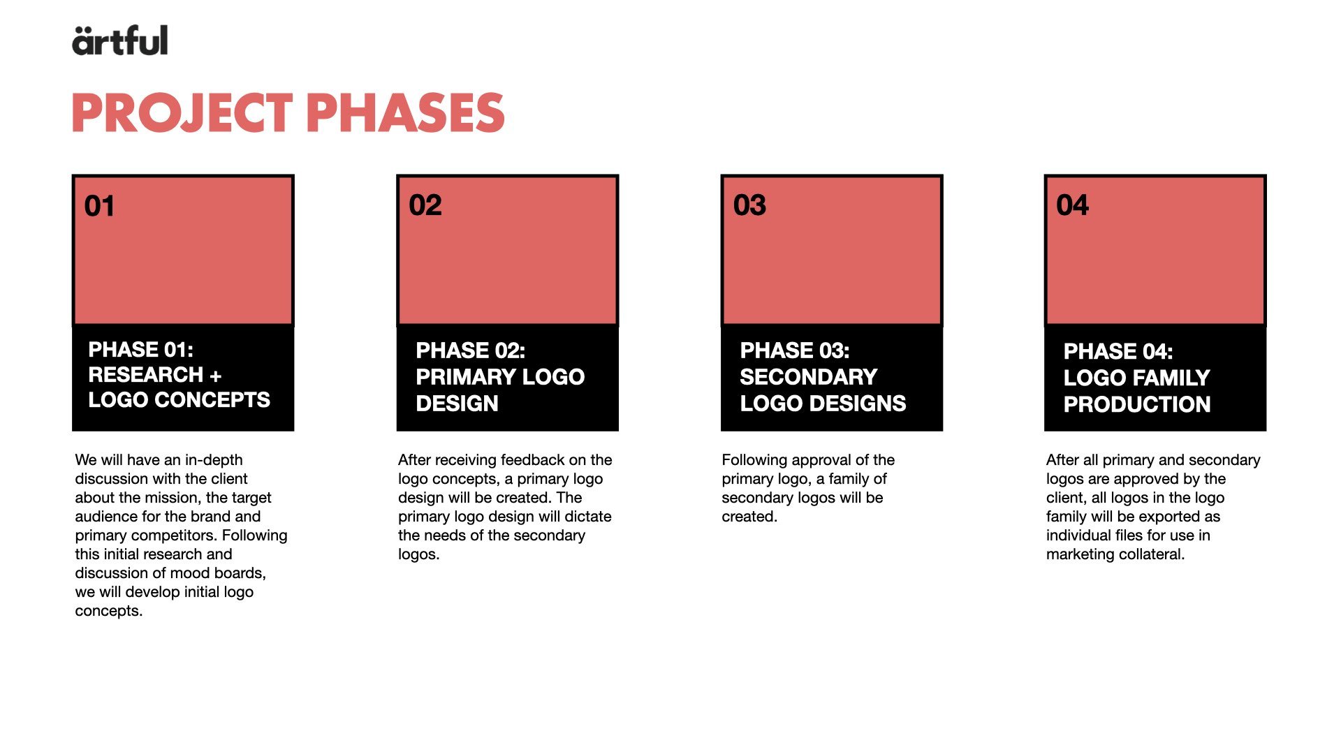
First, we set up a discovery call so I could ask questions to understand her business, what she needed, and if we were a good fit to solve those needs for her. Once I understood the situation and how to support her, we moved on to the more businessy stuff, like the proposal of potential branding materials that we could create together and how that would all break out. Then we established our schedule, budget, and a priority list of the work to do first — starting with the visual identity. We wrapped up the statement of work and payment schedule related to the phases of work and were off. Now, it was time for the fun to begin.
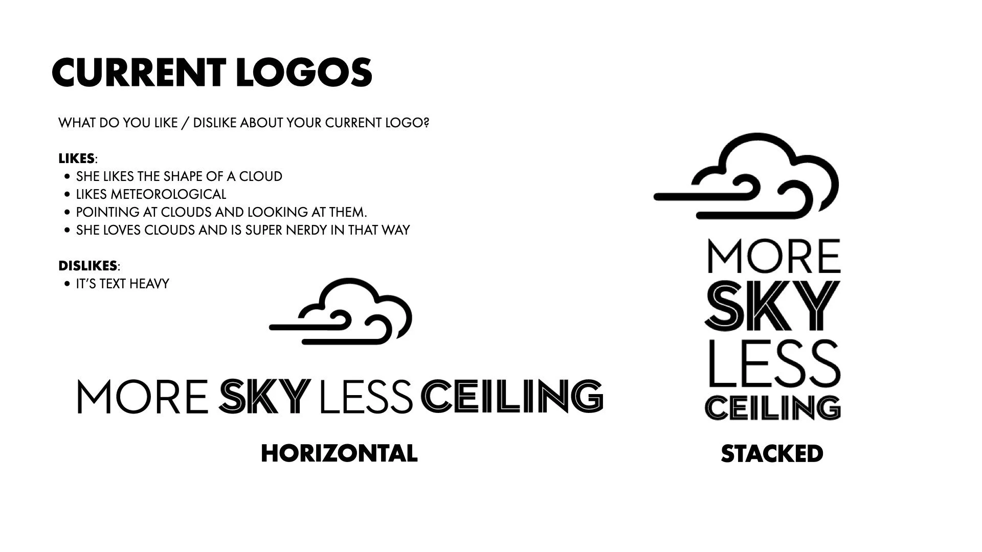
Next, she shared her one-sheet and the existing logos so I could see what she’d been working with. We discussed the things she liked and disliked about them. She said she felt like the text was too heavy and that the logos didn’t look or feel right when next to other logos. She said she did like the cloud reference because of her love for the meteorological side of things. She joyfully informed me that she constantly points at clouds and looks up at them in awe of their beauty because she loves them and is super nerdy about them. I began to explain things about the design choices that were made and how small changes could have improved the logo. For example, the layout and weight of the font used. It seems odd to have SKY and CEILING bolded when the message is MORE SKY and less ceiling. Shifting the weight of the font to MORE SKY supports the overall message visually. She talked about how long and wordy the business name seemed based on this layout and felt that it might have been a bad choice in hindsight. I clarified that it was uniquely as awesome as she is and has a powerful message that deserves to be realized. By keeping the phrases More Sky and Less Ceiling together, the layout feels intentional and reinforces the core message of the business name. We chatted about the size and layout of the iconography and how it related to the text. These were all initial ideas to get the wheels turning for us and to uncover design opportunities for characters and imagery to interact with each other further down the road.
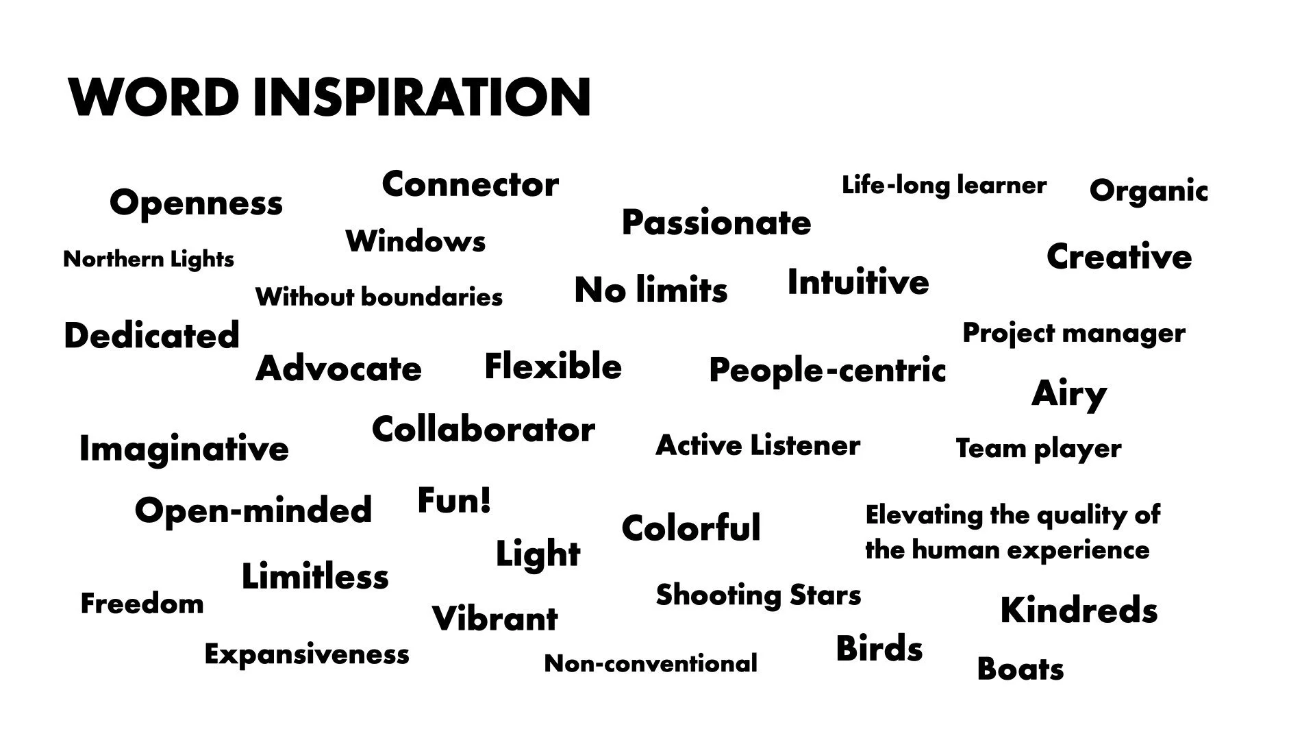
One of my favorite things to do with clients when working together is to have interactive exercises where they can participate in the creation of their visual identity. For instance, I create and share a private Pinterest board immediately upon starting so we have a playground for inspiration as brainstorming begins. I also use word inspiration exercises, like adjectives and phrases to provide a "container" as we define your brand. Then we have all kinds of visual references defining your brand that you can use as we ideate your identity. Tools like this are helpful because they can also provide a foundation of words and visuals we can use for your branding and marketing down the round. Gathering client insights about competitors, favorite websites, types of fonts, and identities that you like are also very helpful during the ideation phase.
As we continue to work through the research and development phase, I’ll ask that you continue to add to your Pinterest board as we refine the container of your brand. This can take some time but once we got into it Rachel seemed to enjoy this exercise. Pro tip: Pinterest is a wonderful resource on the field and off, as we’ve seen over the years. It is a simple, easy tool that can be extremely helpful as we define the container that is your brand. As you begin to find more and more elements that feel right for you it provides a myriad of ideas and options to choose from. Once I took the first round of art, inspiring quotes, power phrases, and imagery Rachel had pinned on her board and organized them into a few separate mood boards, it allowed her to see how they differed. From there we were able to discuss what felt right and what was off or not aligned. Once Rachel could see what felt right and what was missing she was able to refine the visuals that were right for her brand. As she got more and more clear on what aligned with her brand, I was able to iterate the mood boards into the next round. An added benefit to this process is that it provides a pathway to the colors, tone, and feel that align with your brand. Once you’re able to see the brand inspirations together in a unified, intentional layout patterns begin to appear. As I pulled colors from the mood boards, we discovered Rachel’s color palette with ease, all because she helped guide the way. All while getting to have fun with interactive, visual exercises.
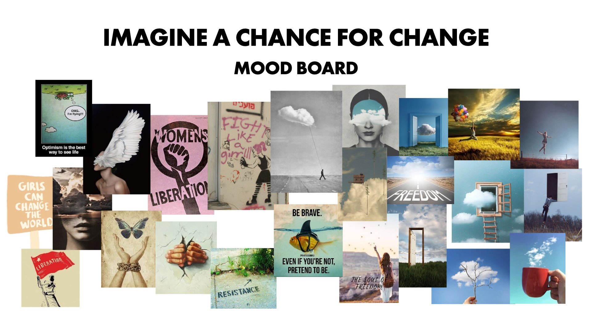
At one point during the process, Rachel reached out with a sense of joy and excitement. She had found THE picture that nailed it — it told the story of More Sky Less Ceiling. It provided a perfect symbolic reference for the personality, purpose, and meaning of her brand. In the early stages of our talks, she had shared that she was not a fan of using ALL CAPS because it was akin to yelling and didn’t feel appropriate for her brand. She was so excited to find the photo that represented her brand so well that she used ALL CAPS in her email. Those breakthrough moments with clients are my absolute favorite moments. It means they are uncovering core aspects of them and their business while being a part of the process which feels good and allows them to feel proud of the identity they helped to create.
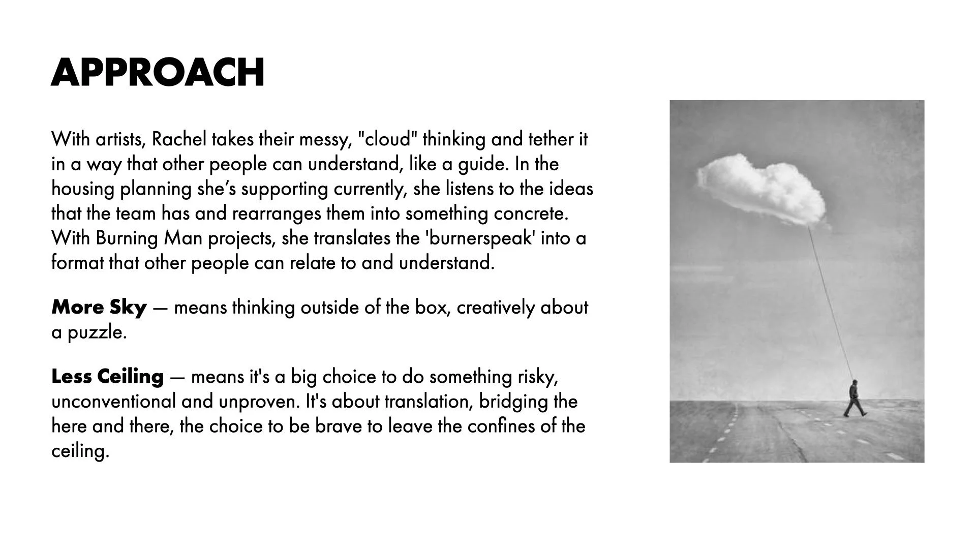
It was time to begin sketching and mocking up logo design concepts. With the brand inspirations, info from our conversations, and mood boards guiding me, I got to work. I created several different options and went through a few rounds to get us to the final logo design that was a perfect fit for Rachel and her brand. Below is the final color logo that she chose for More Sky Less Ceiling. She loves the color blue and it speaks to the visual reference of sky and clouds. Like Rachel, it embodies calm, trust, depth, and intelligence which is why it’s the most popular color in the world for businesses. Rachel wanted there to be a sense of fun and play mixed with a sense of professionalism and maturity. She liked the feeling of nostalgia, timelessness, and whimsy in the font for the wordmark while still feeling strong and professional. We went with the bold font for More Sky and the regular font for Less Ceiling to accentuate the message behind the name, and the italicized look gives a sense of movement and action, especially juxtaposed with the figure walking the cloud. The whimsical iconography perfectly conveys how Rachel takes clients' “messy, cloud thinking and tethers it in a way that other people can understand, like a guide.” The weight of the character walking the cloud balances the More Sky text and the light, airy cloud balances with the thinner font for Less Ceiling. The layout of the new logo doesn’t feel asymmetrical like the previous logos (and plays nicely with other logos), as Rachel requested. I designed several secondary logos that can be used for any kind of format or platform. When I sent her the logo family, I even surprised her with an alternate color version because it just looked so damn cool!
It's empowering to have clarity around your brand. It’s even more impactful when you have a visual identity that embodies the principles, personality, and purpose of your brand. Logos are only a small part of your brand. They act as an identifier for your brand. They don’t have to be bigger to represent you. They don’t have to say exactly what you do. They don’t have to sum up everything that makes up your business. However, they shouldn't make you cringe when you're about to send something off to a client. They do need to make you feel joy and pride when you see them out in the wild. How do you feel about yours? Does it align with your business, who you serve, and why you serve them?
Are you clear on your brand? Do you know your "why" or your mission statement? Know your target audience? Do you have a ten-year vision for your business so you can realize your potential? Well, look no further. I got a lot of positive feedback from people on a new, hybrid coaching program that merges my two passions, brand design, and coaching. I'm offering a 6-month coaching program where we’ll spend three months going through the ten steps to your success then we’ll take the work we are doing together and start transitioning that into creating a visual identity that aligns with your vision, goals, and principles.
Ready to clarify your vision and gain an identity? Check out the Keep Being Artful + Visual Identity package if you're ready to go on this journey together.